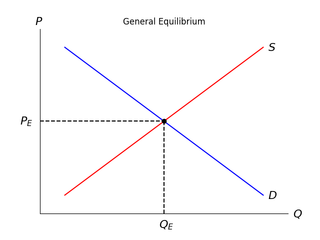
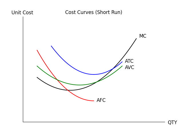
1
2
3
4
5
6
7
8
9
10
11
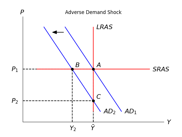
12
13
14
15
16
17
18
19
20
21
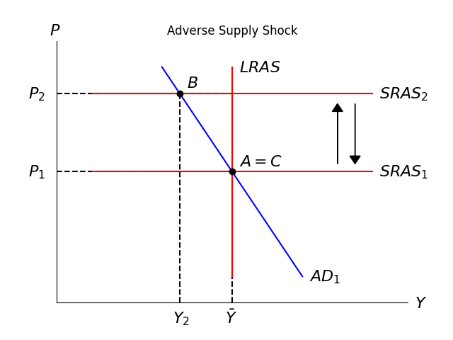
22
23
24
25
26
27
28
29
30
31
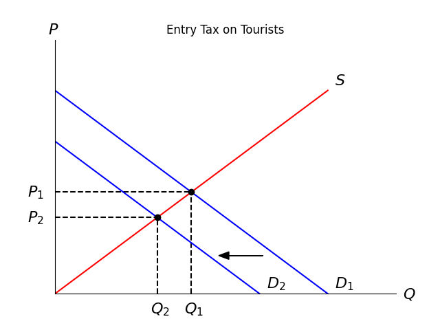
32
33
34
35
36
37
38
39
40
41
42
43
44
45
46
47
48
49
50
51
52
53
54
55
56
57
58
59
60
61
62
63
64
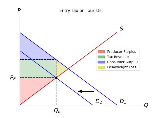
| import matplotlib.pyplot as plt
from matplotlib.patches import Patch
plt.title('Entry Tax on Tourists')
plt.xlim(0,100)
plt.ylim(0,100)
plt.plot([0, 30], [30, 30], 'k--')
plt.plot([30, 30], [0, 50], 'k--')
plt.plot([0, 30], [50, 50], 'k--')
plt.plot([0,80],[0,80], 'r')
plt.plot([0,80],[80,0], 'b')
plt.plot([0,60],[60,0], 'b')
plt.plot(30,30,'ko')
plt.arrow(61, 15, -10, 0, head_width=3, head_length=3, fc='k', ec='k')
plt.text(-8,28,'$P_E$',size=16, color='k')
plt.text(28,-8,'$Q_E$',size=16, color='k')
plt.text(-2,102,'$P$',size=16, color='k')
plt.text(102,-2,'$Q$',size=16, color='k')
plt.text(82,82,'$S$',size=16, color='k')
plt.text(82,2,'$D_1$',size=16, color='k')
plt.text(62,2,'$D_2$',size=16, color='k')
ax = plt.gca()
ax.xaxis.set_tick_params(labelbottom=False)
ax.yaxis.set_tick_params(labelleft=False)
ax.spines['top'].set_visible(False)
ax.spines['right'].set_visible(False)
ax.set_xticks([])
ax.set_yticks([])
ax.fill_between([0, 30], [0, 30], 30, color='r', alpha=0.2)
ax.fill_between([0, 30], [50, 50], 30, color='g', alpha=0.2)
ax.fill_between([0, 30], [80, 50], 50, color='b', alpha=0.2)
ax.fill_between([30, 40], [50, 40], [30, 40], color='y', alpha=0.3)
legend_elements = [
Patch(facecolor='r', edgecolor='r', alpha =0.5, label='Producer Surplus'),
Patch(facecolor='g', edgecolor='g', alpha =0.5, label='Tax Revenue'),
Patch(facecolor='b', edgecolor='b', alpha =0.5, label='Consumer Surplus'),
Patch(facecolor='y', edgecolor='y', alpha =0.5, label='Deadweight Loss'),
]
ax.legend(handles=legend_elements, loc='best')
plt.show()
|